
Introduction
In luxury hospitality, every detail counts—right down to the color of your shampoo bottles. While room design, bedding, and concierge service are the obvious touchpoints for guests, bathroom amenities quietly shape a guest’s perception of your brand. One often-overlooked yet powerful element? The color of your shampoo bottles.
Color is not just a matter of visual appeal; it communicates identity, emotion, and expectation. The right hue can elevate the perceived quality of your amenities, reflect your hotel’s values, and create a consistent, luxurious guest experience. In this article, we’ll dive into how shampoo bottle colors affect branding, guest psychology, and the subtle language of luxury.
The Psychology of Color in Luxury Settings
Color has long been used in branding to trigger specific emotions and associations. In the hotel industry, this principle applies not just to interiors but also to amenities like toiletries, where color can reinforce or detract from the overall brand message.
Common Emotional Associations:
- Black – Sophistication, exclusivity, modernity
- White – Purity, simplicity, elegance
- Gold – Opulence, prestige, indulgence
- Green – Wellness, eco-consciousness, tranquility
- Blue – Calm, reliability, high-quality service
- Silver or Grey – Sleekness, innovation, high-end technology
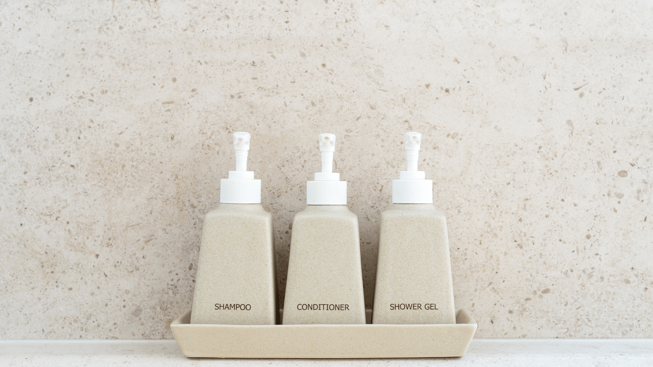
- Beige or Taupe – Natural luxury, understated elegance
The bottle’s color speaks even before the guest opens the cap. It sets expectations, aligns with interior décor, and communicates whether the hotel leans toward traditional elegance, modern minimalism, or eco-friendly luxury.
Black Bottles: The Epitome of Elegance and Exclusivity
Black is often the go-to color for upscale boutique hotels and modern luxury chains. It suggests bold refinement and exclusivity, similar to how black packaging in the fashion and tech world implies prestige.
Best For:
- Urban luxury hotels
- Minimalist boutique stays
- High-end resorts with dark-toned bathrooms
Guest Perception:
- “This place is premium and curated.”
- “These amenities feel like designer products.”
Pro Tip:
Use matte black bottles with metallic labels (like rose gold or silver) to achieve a sleek, Instagram-worthy look.
White Bottles: Clean, Classic, and Timeless
White represents purity, simplicity, and calm—qualities deeply aligned with spa-like luxury. Hotels that promote a serene, bright atmosphere or cater to wellness-conscious travelers often favor white or off-white bottles.
Best For:
- Wellness resorts
- Beachfront villas and spa retreats
- Scandinavian or minimalist interiors
Guest Perception:
- “Everything is clean and fresh.”
- “This hotel pays attention to subtle luxury.”
Pro Tip:
White bottles with subtle pastel labels (like soft lavender or mint) create an aura of quiet sophistication.
Gold and Champagne: Luxury in Liquid Form
Gold, bronze, or champagne-colored bottles scream decadence and indulgence. They are ideal for hotels aiming to convey ultra-premium status or those wanting to emphasize a regal experience.
Best For:
- 5-star heritage hotels
- VIP suites and presidential rooms
- Romantic getaways or honeymoon packages
Guest Perception:
- “This is the kind of place where I get pampered.”
- “Even the shampoo feels expensive.”
Pro Tip:
Avoid overly shiny finishes; opt for brushed metallics to keep the aesthetic modern and tasteful.
Green and Earth Tones: Eco-Luxury and Natural Wellness
With sustainability becoming a core value in the hospitality industry, green, brown, and earth-toned shampoo bottles are making a comeback. These colors convey eco-consciousness, wellness, and authenticity—ideal for hotels with a nature-first philosophy.
Best For:
- Eco-resorts and glamping destinations
- Wellness retreats and yoga sanctuaries
- Brands committed to sustainability
Guest Perception:
- “This hotel cares about the environment.”
- “I’m using natural, clean products.”
Pro Tip:
Use recycled or biodegradable packaging to reinforce the message visually and ethically.
Blue and Navy: Clean, Calm, and Reliable
Blue tones—from sky blue to deep navy—suggest calm, cleanliness, and trust. In shampoo packaging, blue is often associated with professional-grade products, making it a good choice for hotels that want a blend of approachability and sophistication.
Best For:
- International business hotels
- Oceanfront properties
- Hotels catering to both business and leisure travelers
Guest Perception:
- “This feels like a premium yet approachable place.”
- “The amenities are well-selected and professional.”
Pro Tip:
Combine deep navy bottles with silver typography for a modern, trustworthy look.
Beige, Taupe, and Warm Neutrals: Understated Sophistication
Neutral, warm tones give off a quiet luxury feel that resonates with guests who appreciate natural textures and timeless design. These colors blend seamlessly into most interiors and never feel overdone.
Best For:
- Boutique hotels with an organic design
- Luxury lodges and countryside retreats
- Mediterranean-style resorts
Guest Perception:
- “This place is thoughtfully curated.”
- “The design feels natural and high-end.”
Pro Tip:
Pair with textured labels (e.g., linen or kraft paper) to emphasize artisan, handcrafted charm.
Color Matching with Bathroom Interior Design
Your shampoo bottle color shouldn’t be chosen in isolation. It should complement your bathroom design, towel colors, and lighting tones.
Examples:
- In all-white bathrooms, black bottles can create a high-contrast, modern appeal.
- In warm-lit bathrooms, gold or taupe bottles enhance the ambient glow.
- In nature-inspired designs, green or stone-colored bottles support the concept of serenity.
Consistency is key—your bottles should never feel out of place. Think of them as mini brand ambassadors in each room.
Beyond Color: Labeling, Typography, and Texture
While bottle color sets the tone, the full effect is achieved through the details:
- Typography: Sans-serif fonts for modernity, serif fonts for elegance
- Label shape: Minimal rectangles vs. flowing curves
- Finish: Matte for elegance, gloss for vibrance
- Cap and pump style: Metallic for sophistication, wood for eco-style
A black bottle with gold foil and a matte finish tells a very different story than a glossy green bottle with a kraft label—yet both can be luxurious in their own right.
Conclusion
In luxury hospitality, nothing is truly “just a shampoo bottle.” Every element guests see, touch, and use reflects your brand’s identity—and color plays a leading role in this silent conversation.
By carefully choosing the right color for your shampoo bottles, you can:
- Reinforce your hotel’s branding
- Enhance the perceived value of your amenities
- Align with your target audience’s expectations
From the stark elegance of black to the organic calm of earth tones, the right color speaks volumes about who you are and what kind of experience you promise. So the next time you restock amenities, think beyond product quality—think color.